
Element state (desktop, hover...)
Although slidde is as easy as a graphics design tools. Element states are the function that achieves responsive web design and interactive animation. By using element states, you can make a beautiful poster, then turn it into a real webpage.
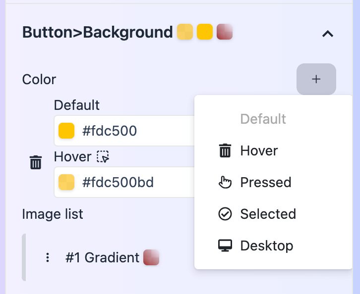
By clicking the button you can see what element states are allow for this style property.
Default
The default state for this style property.
Desktop
The desktop state is defined to specifically targeting desktop screens. This allows you to tailor your design for larger displays, ensuring optimal layout and functionality on desktop devices.
When you add desktop state for a style property, the default state applies to mobile screens, and desktop state applies to desktop screens. You usually set large font sizes and spacings for desktop state.
Hover
The hover state is triggered when a user moves their cursor over an element. It’s useful for indicating interactivity, such as highlighting buttons or links.
Usually you can set colors, scale, rotate for hover states.
Pressed
The pressed state is activated when an element is clicked or tapped. This can be used to create a visual feedback effect, indicating that a button or link has been pressed.
Selected
The selected state applies to a button or link when it matches the current URL. This is often used for navigation menus to highlight the active page.
Focus
The focus state is used for inputs and textareas when they are selected, typically via keyboard navigation. This helps users identify which input field is active.
Placeholder
The placeholder state styles the placeholder text within inputs and textareas. This can be customized to match your design aesthetic.